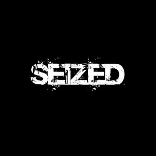
 This is our final typography idea for out title. We decided to use this as it is bold and stands out as the writing is white on a black background. We created this in a website called Picnik. We then decided to download the font we used so we can use it throughout our title sequence. We feel as a group that this font represents the stalker/investigator very well within our film as it looks like its decaying.
Try to add a bit more detailed analysis of your typography and what it connotes.
ReplyDelete